
Breadth Divergences + Slight New Highs = Not Good.
Price chart analysis and commentary

Expectations about an interest rate cut are at the “it’s a certainty” stage among Wall Street money managers and they just keep buying, mainly the stuff they had been buying. They’ve added small caps to the “positive look” list, a move heavily dependent on the rate cut soon scenario, for sure.
The clarity of breadth divergences from price movement is a big problem but few want to go there as everyone feels so good about portfolio yearly returns thus far. Nevertheless, letting “feels good” influence decisions without taking into account the negatives can lead to unfortunate outcomes.
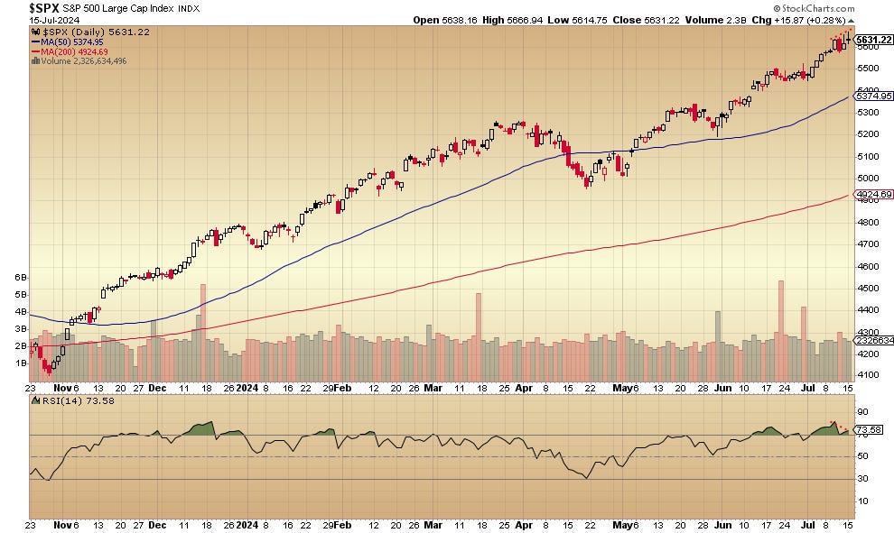
The S&P 500’s daily price chart is here:
The new highs/new lows percent for the S&P 500 looks like this:
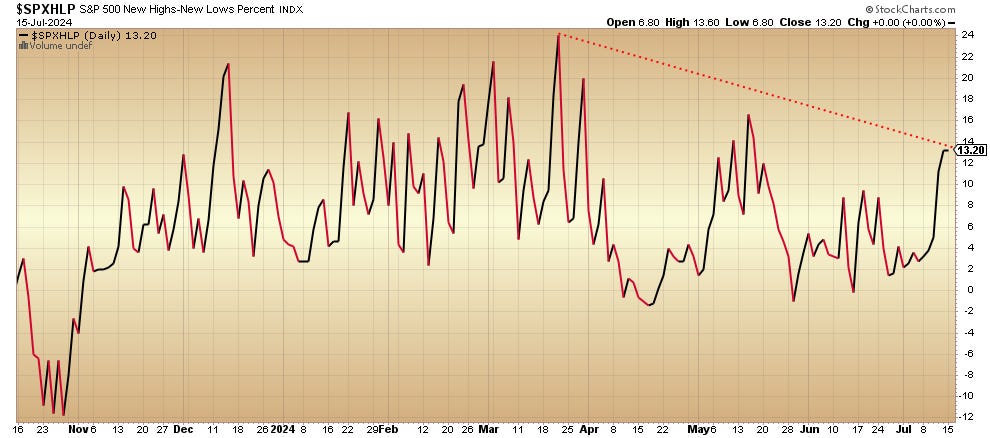
At a moment of new price highs, the new highs/new lows percent is nowhere close to the March peak.
The percent of S&P 500 stocks in bullish point-and-figure patterns is here:
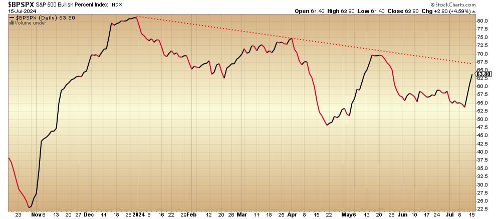
That’s a steady decline from the December 2023 peak despite the steady rise of the S&P 500 since then.
The daily price chart for the Nasdaq 100 is here:
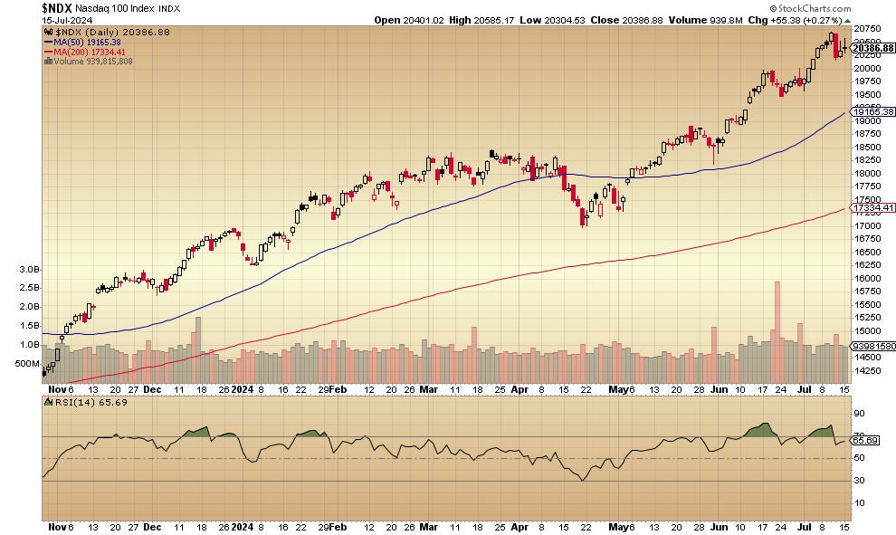
No new high today.
Here’s the new highs/new low percent for the Nasdaq 100:
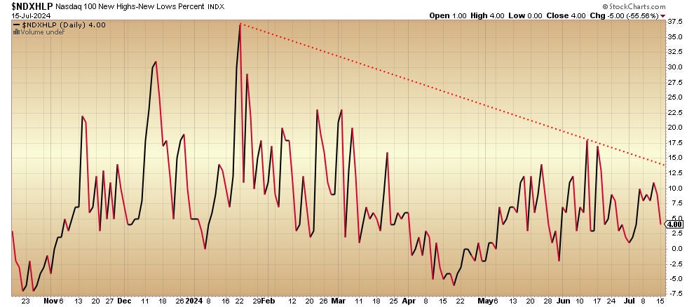
It’s remarkable that this just keeps declining even as the index hits higher price highs since January.
Here’s how the Nasdaq 100’s percent of stocks in bullish point-and-figure patterns looks:
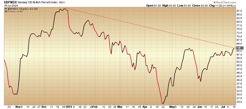
Although it’s recovered from the April low, it’s troubling to see how weak it remains compared to the December 2023 level — even though the Nasdaq 100 itself is much higher than December 2023.
Not investment advice. For educational purposes only.
No artificial intelligence was used in the composition of this writing.
I write here as well: John Navin (forbes.com).