
CrowdStrike Crash Keeps It Interesting. Bonds Drop. Oil Price Slips.
Price chart analysis and commentary.

The CrowdStrike selling keeps tech traders on edge for the weekend. Expectations for interest rate cuts seem to be fully priced in (for now, anyway) as Treasury bonds slid with yields headed back up. The oil price declines take it down to a new low for the month of July.
Later in this post, for paid subscribers, I’ll be listing the best looking of the trending stocks that have recently broken above a resistance level or broken below a support level.
Here’s my annotated daily price chart for the S&P 500:
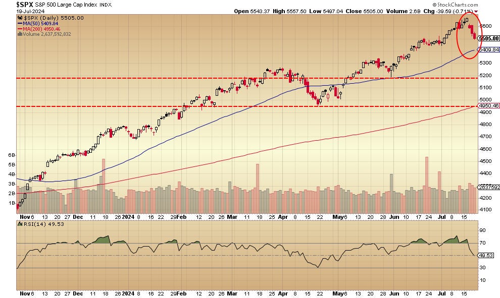
The 3 days of red selling candlesticks, with Wednesday’s slight gap down, is nothing out of the ordinary. It’s similar to the mid-April slide. That the index remains above an up trending 50-day moving average shows strength. Same thing for the up trending 200-day moving average.
The red-dashed line just below 5200 is the first level of significant support — it’s a stop-loss area for shorter-term traders. That red-dashed line at 4950 is a more critical level of support — longer-term investors may want to look at that spot for stop losses (my opinion, not advice).
The daily price chart for the Nasdaq 100 looks like this:
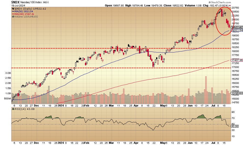
It’s not that different in structure than the S&P 500: 3 red candles that remain above an up trending 50-day moving average and an up trending 200-day moving average. The first support level is just under 18250 and the more serious support level is just below the 17000 level. My opinion/not advice: these are spots to think about placing stop losses.
The daily price chart for the iShares 20-year plus U. S. Treasury Bond ETF is here:
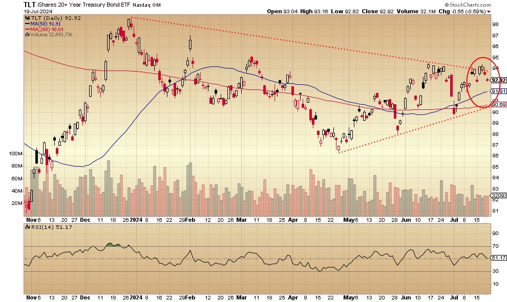
That it’s trading above both up trending 50-day and 200-day moving averages might be good news for investors. Nevertheless, it’s inability to stay out of the trading range defined by the red-dotted lines is a problem. The price broke above it early in the week only to return to within it on Thursday and Friday. This, even though almost every Wall Street analyst is looking for a rate cut and soon. You might have expected bonds to really take off, but no. It’s odd.
The daily price chart for the United States Oil Fund is here:
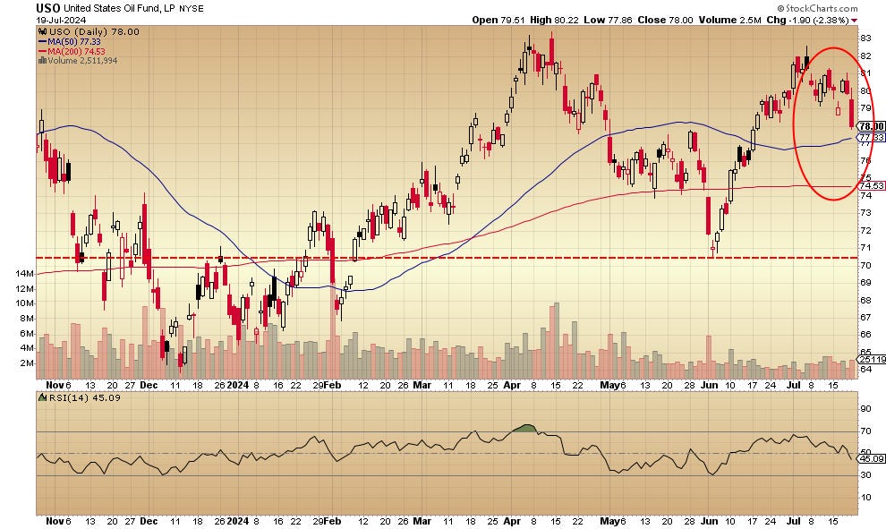
Friday’s drop of 2.38% is a July low for the fund which reflects the movements of West Texas Intermediate Crude. The price remains above both the 50-day and 200-day moving average. The red-dashed line indicates the likely support area (where buyers showed up in early June) and a close below this might be a signal to move out.
Not investment advice. For educational purpose only.
No artificial intelligence was used for the writing of this post.
My other writing can be found at John Navin (forbes.com).
Here is a list of stocks in definite trends, now breaking through previous resistance and/or support levels — this is for paid subscribers only:
Keep reading with a 7-day free trial
Subscribe to John Navin's Newsletter to keep reading this post and get 7 days of free access to the full post archives.